Fred's Café
branding and social media
When Fred’s Café in Manchester approached me to design their new logo and digital branding, I knew I had to capture the essence of what made them special. The café wasn’t just another coffee shop – it had a unique vibe, a warm, cozy atmosphere, and a menu full of fresh, locally sourced dishes.
The challenge? I had only two weeks to bring their vision to life.
I dove into the client’s customer research, understanding what their audience valued most: a welcoming space to enjoy great food and little touches that made their experience special. Using these insights, I began shaping the design. Every element had to reflect the relaxed charm of Fred’s – from the logo’s clean lines to the colour palette that felt as inviting as a morning cup of coffee.
"Lucy really got what we wanted for Fred’s Café. She listened to our ideas and added her own creative touch, making the whole process easy and stress-free. The final branding feels true to who we are, and we’re so happy with how it turned out. Would definitely work with her again!" → Freddie, Fred’s Café owner.
Process
01
client interview
After an informal interview with my client, we started by exploring the customer research they had gathered, along with their vision and ideas for the café.
02
inspiration boards
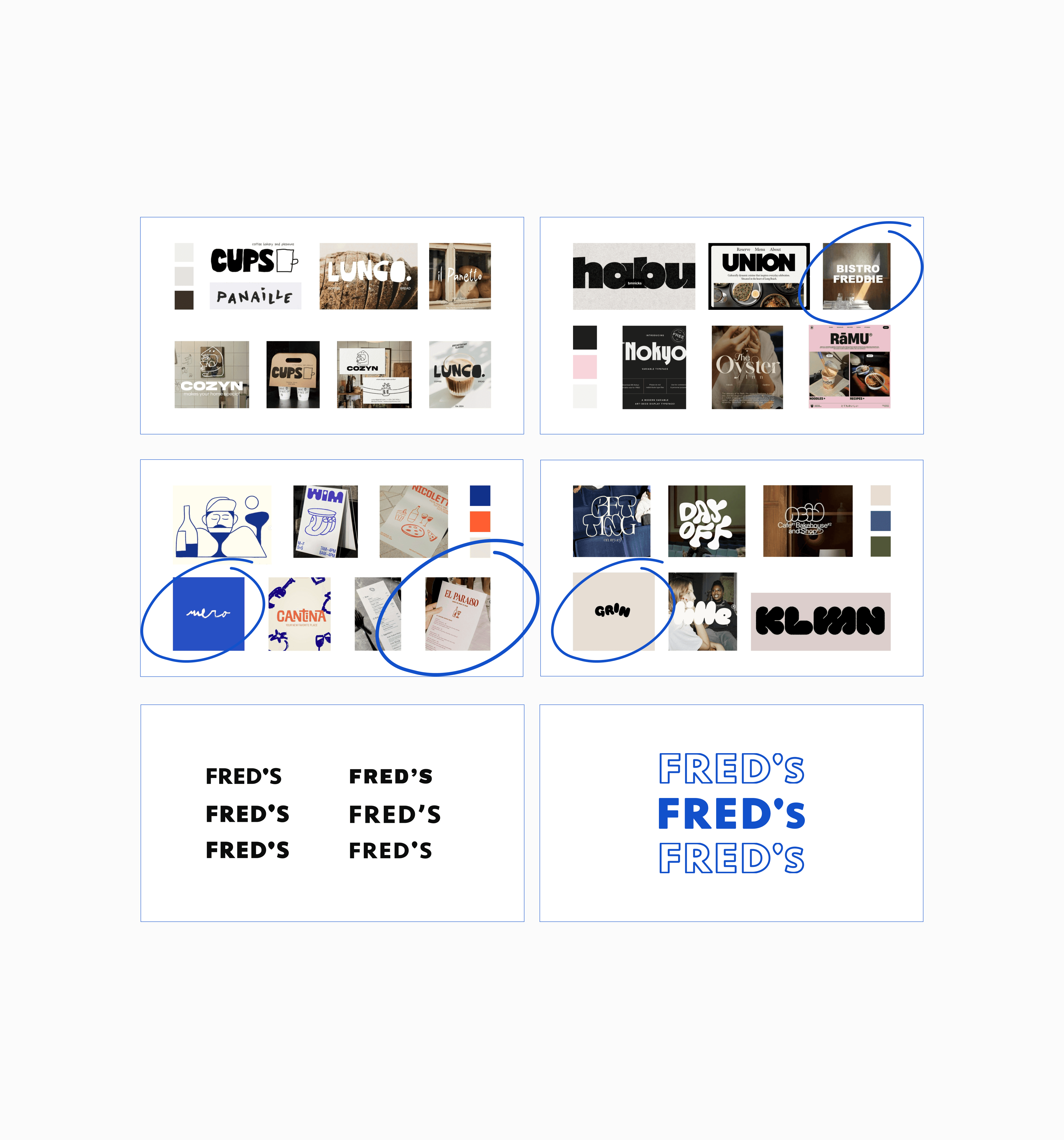
Following a reference search, I spent time with my client reviewing mood boards. Together, we discussed their preferences and highlighted key elements (see below), which helped me better understand their taste and identify styles to explore further. We also talked about colour options, focusing on which ones stood out to the client and why, giving the design a clearer direction.
03
ideas
Based on the client’s feedback, I explored several typography options. From the beginning, they emphasised a strong preference for a clean, simple font, which guided my focus toward a minimalist style. After a few iterations and the customisation of an apostrophe, the final design was completed.
Next steps
01
development
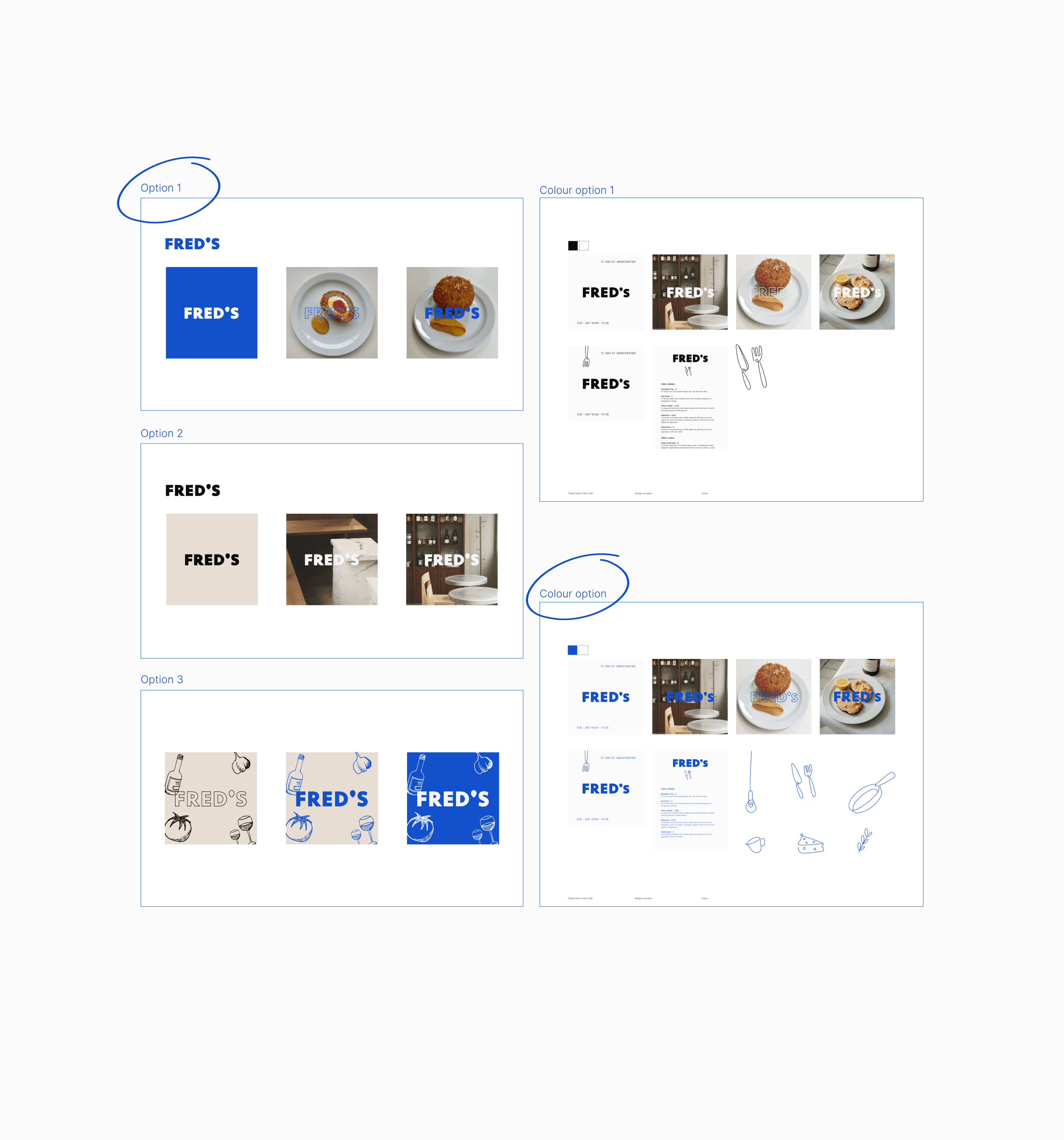
I explored the idea of overlaying the logo on images and adding illustrations as the client expressed interest in this style. To refine the concept, I experimented with different logo sizes and colour variations. The client selected their preferred option, which I then could develop further.
02
defining ideas
To ensure the chosen colours conveyed the desired style and vibe, I tested the designs in both black and white as well as in colour. I then shared these variations with the client for their feedback to confirm everything worked as intended and we agreed the illustrations needed to developed more given more time.
Style
01
menu
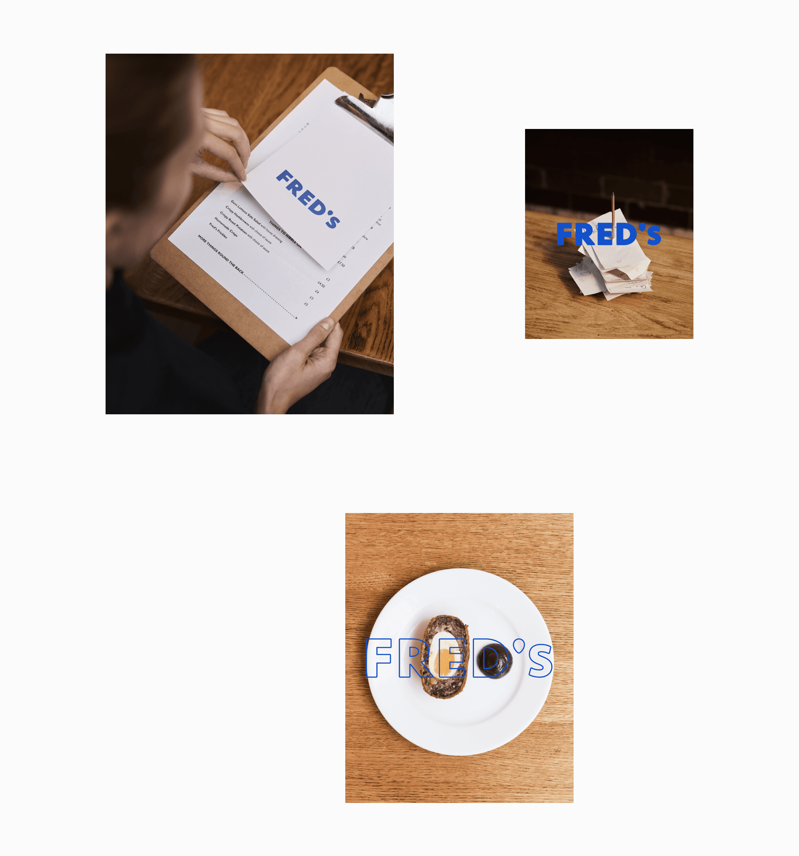
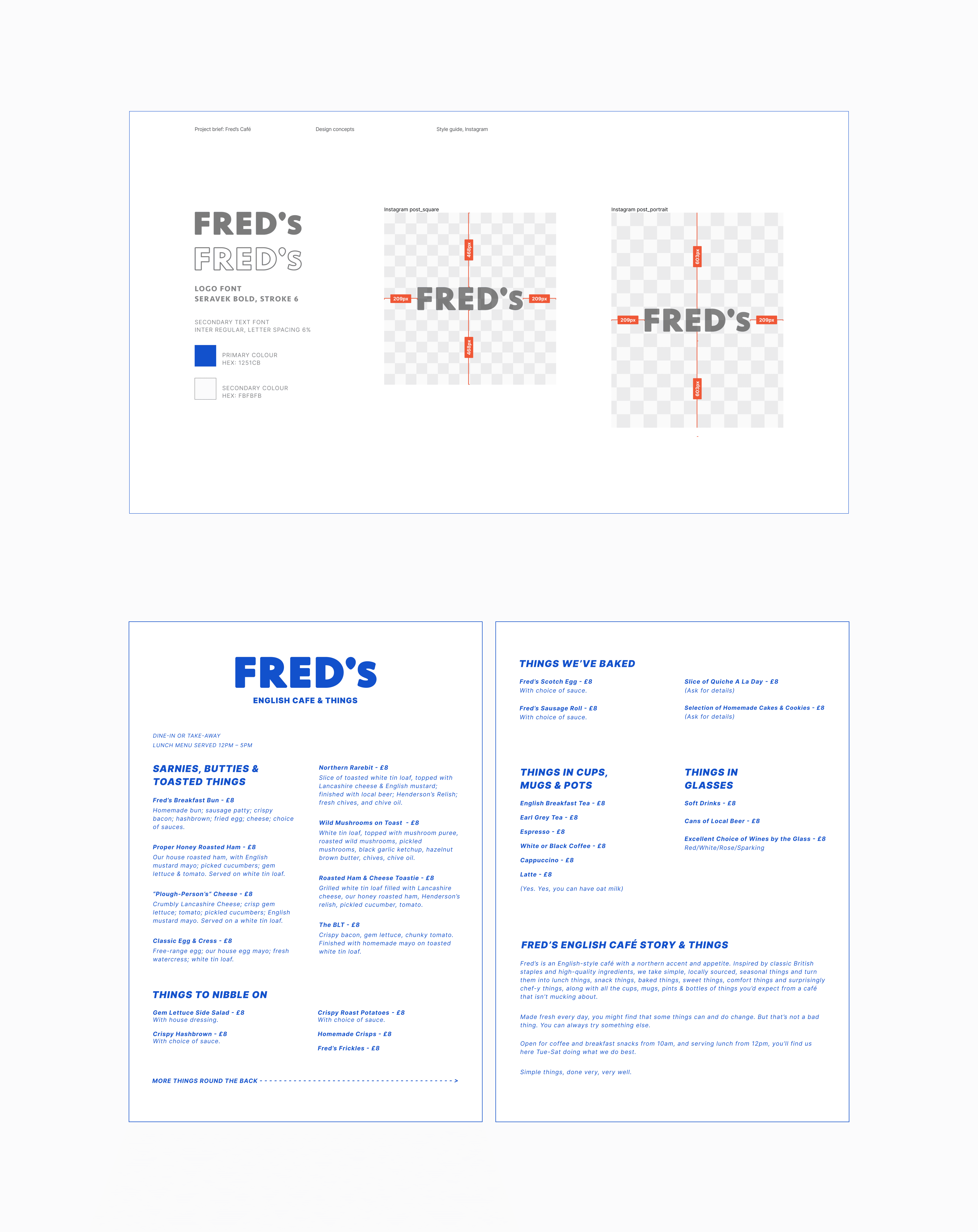
I faced a challenge with the menu design when I realised the client needed to update and print it frequently and wasn't familiar with computer design tools. After discussing their preferred software, we agreed Pages would be the best option. I then redesigned the menu in Pages, keeping it as close to the original Figma version as possible.
02
style guide
To ensure the selected colours captured the desired style and vibe, I tested the designs in both black and white and full colour. I then shared these variations with the client for feedback, confirming that the overall approach worked. However, we agreed that the illustrations needed further development, given more time to refine them.
Social media
01
collaboration
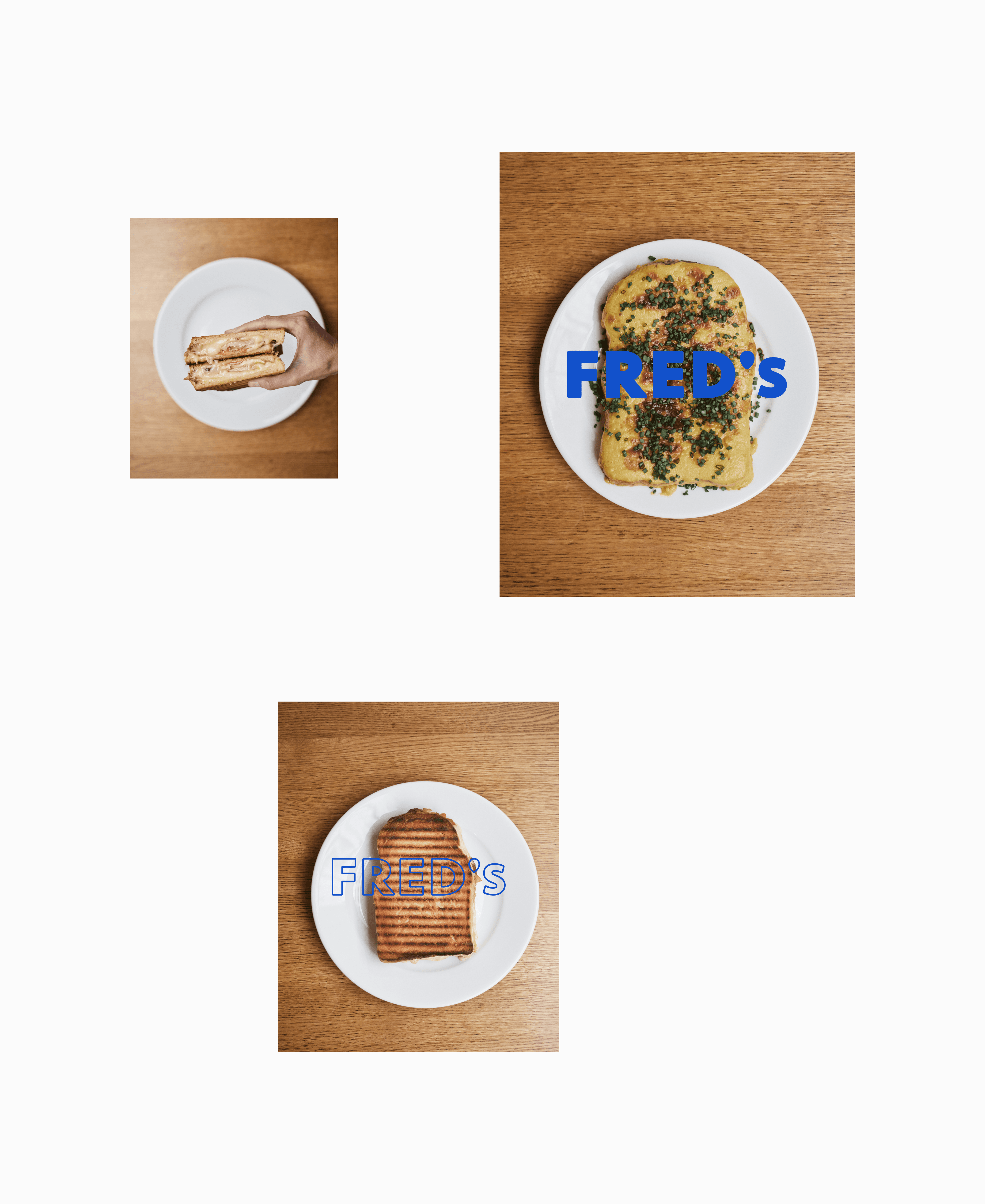
Working with a photographer, we developed a cohesive Instagram layout design to showcase the café's food and build brand recognition, helping establish Fred’s presence as a new café.
02
Instagram [shown below]
03
gif [shown below]
Visit Fred's Instagram
