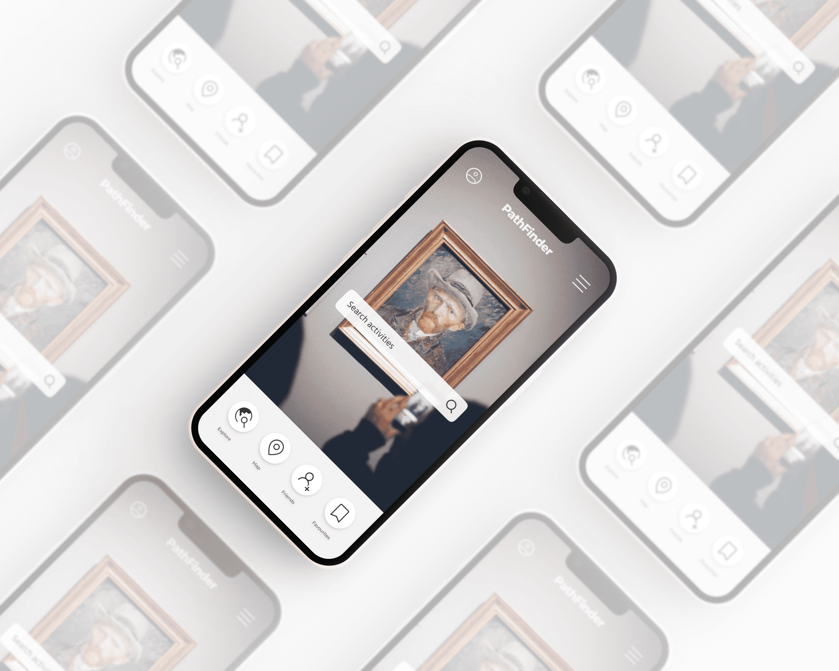
Path Finder
Location based recommendation tool — UX/UI design case study
introduction
When I first looked into location-based recommendation apps, I noticed a common issue: despite offering helpful suggestions, they often came with overly complicated navigation. People were spending more time trying to figure out the app than enjoying the experiences it recommended.
I wanted to change that. I decided to design a new platform, one that put the user first. The solution had to be more than just another recommendation app - it needed to feel like it was truly designed around the user’s needs.
Key Deliverables
UI/UX, user research, user interviews, user personas, user flows, usability testing, style guide, iconography, wireframing, prototyping, responsive design.
Tools
Figma
problem
Many current location-based recommendation apps can be difficult to navigate, often presenting users with irrelevant results and limited personalisation. This can make it frustrating for users to find points of interest that truly match their preferences and location.
solution
To create a better experience, a new, user-friendly platform has been developed with a focus on user-centred design. By listening to users through interviews and creating personas, the app was thoughtfully designed to meet the unique needs of different users.
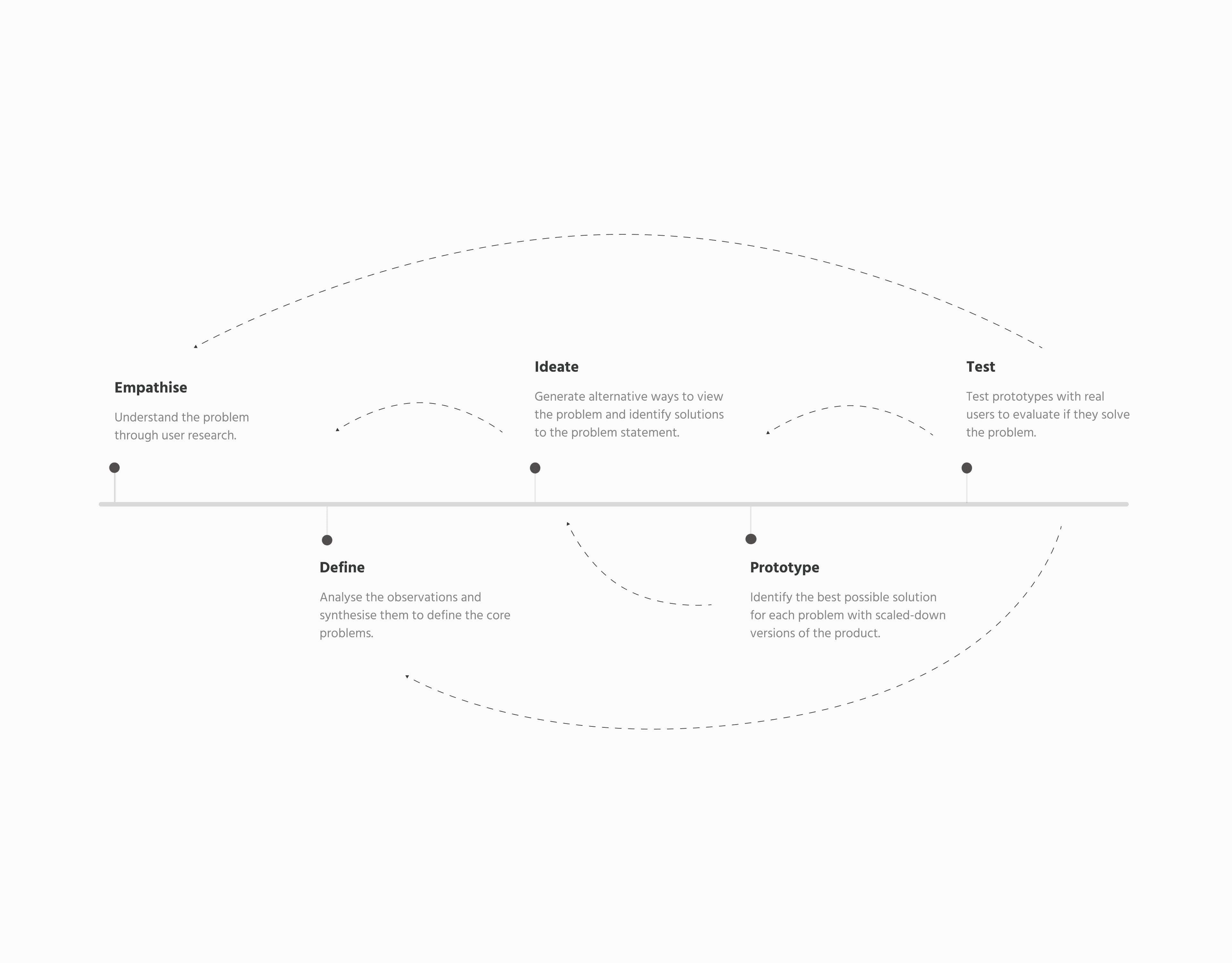
The design thinking cycle
Process
01
user research
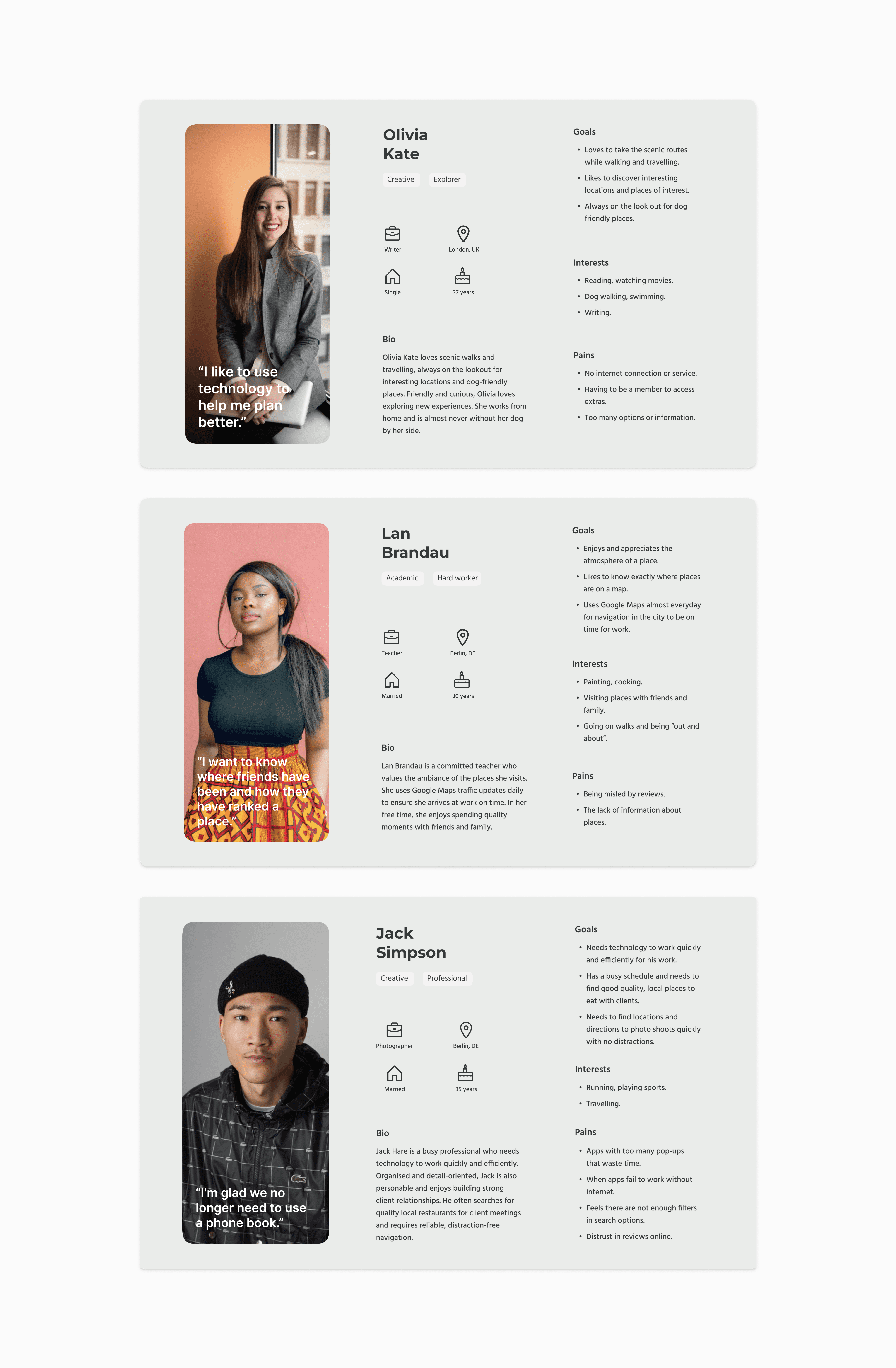
Through user interviews, direct insights into user needs and challenges were gathered, guiding design decisions and ensuring the final product is user-friendly and aligned with real-world expectations. From this information user personas were developed.
02
User Personas
Representing the needs, goals, and behaviours of different user types.
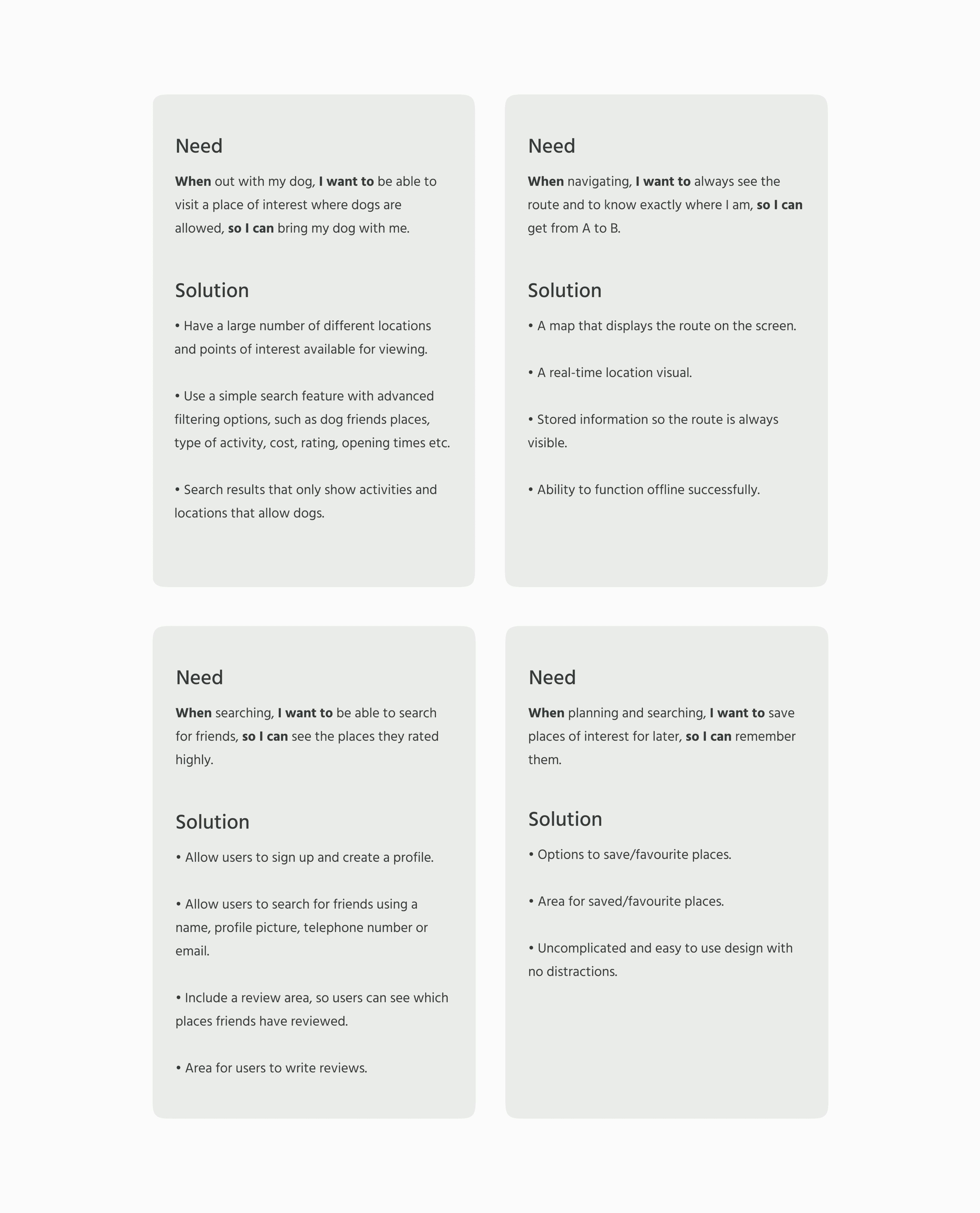
Jobs to be done
01
User cards
Understanding the main tasks users aim to accomplish when using a recommendation-based location app helps in focusing on the outcomes they desire. Identifying these "jobs to be done" ensures that the web app includes features and functions aligned with the user's goals.
Next steps
01
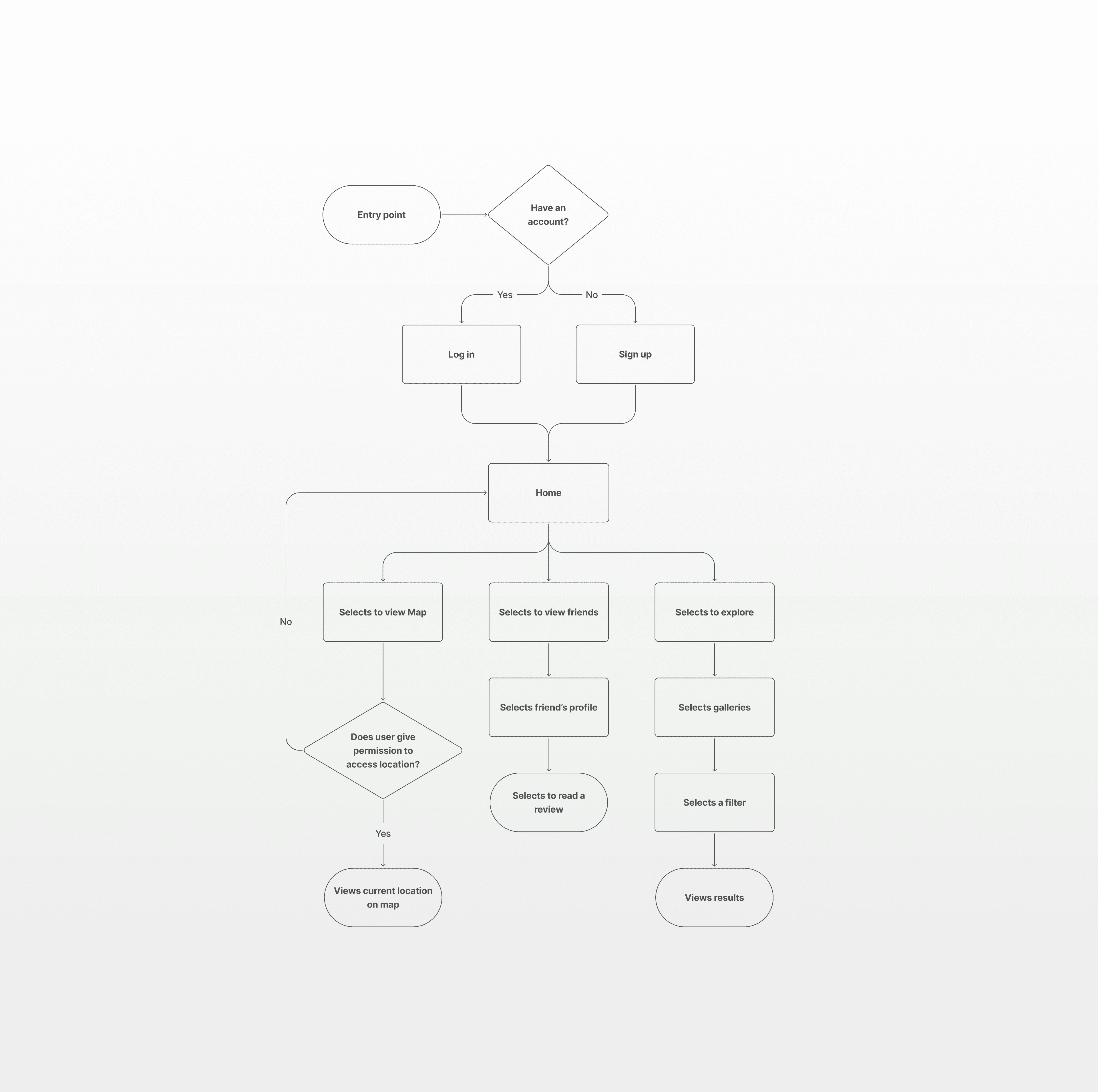
User Flow Diagram
Visual representation to outline the steps a user will take to complete a task or achieve a goal. A sequence of actions and decision points were mapped out to help understand and optimise the user experience.
Development
01
Rapid Prototyping
Users were asked to complete tasks using an interactive prototype. The goal was to observe whether participants could easily navigate the basic initial functions such as logging in and adding filter options to their search. Pain points were then identified, resulting in key insights and iterations.
02
Key insights
Pain point → Users suggested a "favourite" option so an activity can be saved and viewed later.
Solution → Incorporating the option to “favourite" activities and “view favourites” into the design.
Pain point → Users almost pressed the “No” option instead of “Yes” on the map permission screen, mentioning that it would feel natural for the yes to be on the right side.
Solution → Swap the placement of the “Yes” and “No” button options, while making it clear in the design that the buttons are related to one another, but form a different function.
Wireframing
01
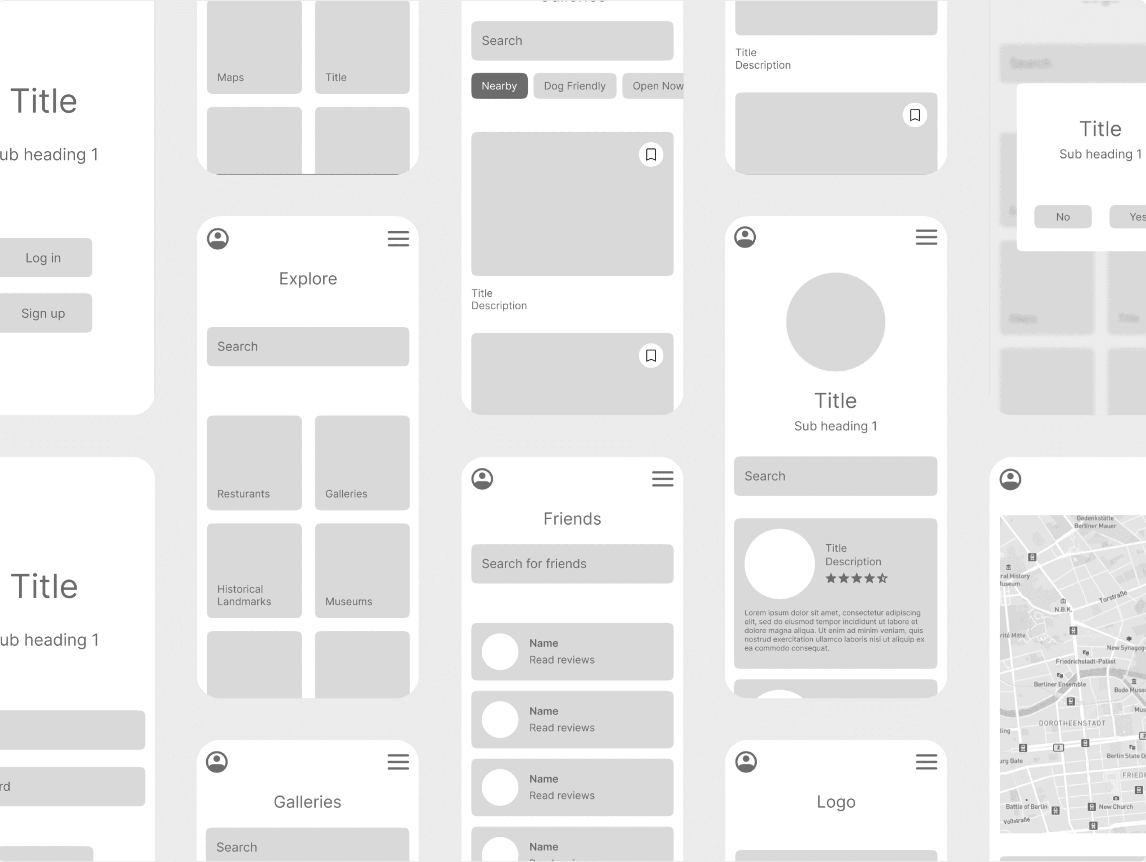
Mid Fidelity
Mid-fidelity wireframes feature a clearer representation of layout, content placement, and basic functionality without the distraction of full design elements. This approach allowed for early testing of user flows, helping to identify usability issues and refine the design. By focusing on layout and function, mid-fidelity wireframes provide a solid foundation for visual design and development, ensuring that the core user experience is well-defined before finalising aesthetics.
Brand guidelines
01
style guide
This style guide outlines the standards and guidelines for the visual content of the project. It includes specifications for logo usage, colour palettes, typography, icons and other elements to ensure a consistent style, colour scheme, and emotional impact throughout.
02
Style Rationale
The natural colour scheme complements the tone of the POI app, aiming to be easier on the eyes and creating a more enjoyable, calming, stress-free user experience. The use of a few colours also provides more flexibility in the design.
View online style guide

